Wednesday, December 4, 2013

Final Texture Reflection

Final Texture Reflection

Degree of Exploration:

1. My collection of textures are extremely varied, ranging from natural to geometrical textures. I have used natural textures such as wood, leaves, and flowers while using inorganic textures such as glue, metal chains, and mesh.
2. My organization of the textures were very meticulously planned. I felt that using inorganic textures were more interesting when paired with other inorganic textures, and natural textures were more interesting with other natural textures. I experimented with both in one art piece, and found that although they do work together, I preferred using similar textures in one art piece. Through experimentation of textures, I found my preference when combining textures.

Degree of Craftsmanship and Attention to Detail:

1. As stated above, my exploration and varied combination of textures are exemplified through my artwork. You are able to see unique combinations that may not be common, but work. And through there various combinations, I was able to find my preferences.
2. I worked my absolute hardest to find different textures that complement each other and find texture that work well when left alone, my work experiment with both and as I developed my textural skills, I was able to refine my work and improve tremendously.
3. My final texture block is very unified as I used both inorganic and organic textures, but not so in a manner that is puzzling and confused, in a way that they complement each other. On one side, I used organic textures and used geometrical texture on the other. Not only do they vary in shapes and sizes, but they tend to vary in color, giving my final texture block contrast between colors.

Level of Technical Understanding and Growth:

1. I have developed technically grown through my artwork as I refined my skills and techniques when using textures. I have improved my capabilities of using textures digitally and physically. My sculptures and physical textures tend to lack as much variation of textures as my digital works, but that is a personal preference which I have been able to make through experience and exposure to these different types of compositions.
2. As I worked, I was able to improve my skills and find that now, my artworks are in fact free of glaring technical flaws as I have been able to identify those flaws and fix them. My works benefitted from these lack of glaring flaws as my work has improved in quality.

Wednesday, October 30, 2013

Final Reflection

After completing my black and white paper cutouts and my final rayogram, I reflect and see that I tended to be drawn to geometric shapes with small areas of natural shapes and figures. But while using these geometric and natural shapes, I found that in these projects, I found that I was working towards on common goal, to create contrast and show negative space in my art. My most compelling piece of artwork was probably the rayogram because I feel that it displays balance, contrast, directional movement and was an overall interactive piece of art. It was by far the most laborious of my work, it required on to find objects that would display negative space nicely. Next one would have to scan it under a light for 8 seconds after positioning their objects, then use the developer, the fixer, the stop bath, the water wash, the perma wash, and then a second water wash. This process was not too time consuming, but it was laborious. While creating these artworks, I was forced to work and rework the pieces to satisfy what I had previously envisioned the end result to be. I probably spent half (or more) of my time repositioning my objects to fulfill my vision and ultimately create a, what I believe is, well unified pieces of art. One artistic habit of mind that I had was engage and persistence. I was constantly readjusting the materials on my works and was always trying to connect one object with another and trying to tie up all of the materials to one message or expression. But while I excelled with engaging and persisting, I lacked stretching and exploring new concepts. I repeatedly used the same ideas and foundations for my works. I used geometrical object that tended to be larger or more interactive than the small natural objects I would use. I never used all geometrical figures or all natural figures, but rather stuck to my comforts and built off those. Not that staying in your comfort level is bad, but I would rather reach out and stretch to explore new concepts and maybe develop new artistic traits.

Monday, October 28, 2013

Final Rayogram

This rayogram is my final one for the time being. It was done on a much larger scale than others with the same amount of simplicity. It demonstrates balance, but unperfect balance which adds characters and artistic effect to the picture. It has contrast, similarly to all rayograms. and it has directional movement, dragging your eye in a loop around the page, leaving a blank space in the middle.

Monday, October 21, 2013

Rayograms

These rayograms display natural objects, found outside. By creating a rayogram, the image displays the negative space of an object, rather than what is normally used, positive space. These all fall under contrast, and most fall under directional movement. Both images on the left portray a directional movement, the top moves your eye from left to right while the bottom moves it from left to right, then back to the left. The rayogram on the right displays unity, as both object come together to form one. This object is unique because as it seems that the leaf is covering it, you can see the stem of the the plant on the left.

Monday, October 14, 2013

Black on White Cutout Project

This black on white shows directional movement, starting at the center and dragging your eye in a loop, and bringing it back to the bottom, ending in abstract shapes. The circle in the center represents many things and others see it differently. I mainly used organic shapes with 2 exceptions. One thing that was very interesting was the center piece because many see it differently and it represents many different objects. I feel that this composition was more intruiging than the other white on black composition for many reasons. I feel that this design is much more interesting, interactive, abstract, and symbolic. Unlike the other composition, this piece of art relies on the eye of the viewer to determine what it means, and it relies on them to see the direction movement carrying their eye in a spiral.

Wednesday, October 9, 2013

White on Black Cutout Project

My paper cut-out was very symbolic, the chair in the top left corner was a very carefully cut-out object with many different, unique objects, stemming to drag your eye away from the corner of the paper, where the chair is. The point of the cut-out project was to represent what isn't there rather than what is. One of my favorite cut-outs that is new, abstract, and adds a lot of depth, is that line steeming out from the corner of the chair with three humps. I feels that tthe contrast in thickness adds depth and is intruiging. 

Thursday, September 26, 2013

Calder Wire Project

My wire projects uses lines to give a sense of direction and strength. It shows this man's strongest and weakest points of his body. My sculpture illustrates technical development Because as I made straight lines with no three dimensions, no standout, I began to wrap them in wire, not covering them, but to shows where this man's strongest points are. My sculpture very closely resembles my drawing. I originally started with a football player and built off of that concept. But as this project progressed, I stopped worrying about it resembling a football player, but rather that it have a sense of direction. I wanted to be able to envision this man running at a full sprint and I feel like I fulfilled that goal.


Thursday, September 19, 2013

Interim Wire Project

This is my wire person. He is nameless but has much soul. He plays football for a living and nothing else.

Tuesday, September 10, 2013

Contour and Gesture Drawings

I liked this drawing because it focused on shading, so instead of using a fine point pencil to draw the bodies, I shaded them.

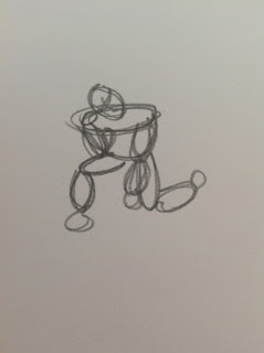
I liked this drawing because I felt that the lines were very vivid and I thought that it resembled a person Tebowing very well. The muscles are varied and add much description to the picture.

I liked these drawings because all resembled a body at peace and/or in motion. I thought the muscle descriptions varied, showing the true strength of that human being and the strength of their poses.